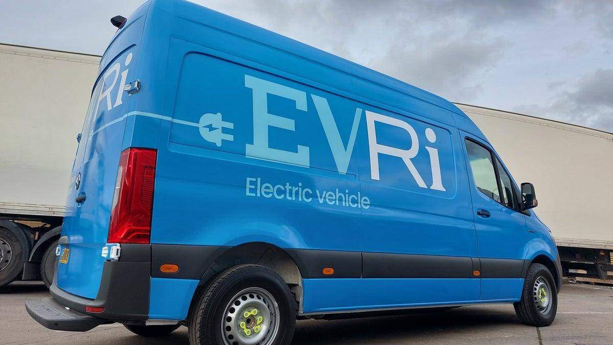
Hermes Rebrand: What Does EvRi-One Think?
Is the Hermes to Evri rebrand a marketing masterpiece or every graphic designer’s nightmare? Our Graphic Designer, Steve Hillyard, tells us what he thinks in our latest blog. Read on to find out what he thinks about this controversial rebrand, which has over 194,000 logo possibilities!


By Steve Hillyard
Delve into Steve, our graphic designer’s opinion on the EvRi/Hermes rebrand and what he thinks they’re trying to accomplish by this strong and questionable move.
Hermes was the ancient Greek god of trade, wealth & luck, among other things. They had pretty big shoes to fill for a delivery company, so when their reputation went Pete Tong, it was time to rebrand, which gave the multi-million-pound business a chance to reinvent itself and reset its public perception.
It’s like when I left school as an introverted nerdy kid who played the clarinet to when I started college, grew my hair long and joined a band. Rock n Roll! But instead, Hermes has decided to rebrand themselves for a fresh, new identity that’ll hopefully allow them to salvage a reputation as a reliable delivery service.
But why? Here are my thoughts on why Hermes has decided that EvRi is the way to go.

Firstly, what is Hermes trying to do?
NAME
When it comes to the name choice, they have decided to go for a much more humanly approach than godly, and I’m guessing the message behind this is to be all-inclusive to ‘evri-one’. Good call, much more humble.
FONT
When choosing a typeface for a brand, I look at the overall feel in the fonts – are they friendly, elegant, bold, stern, fun… What impression do they give, and does that match the company’s intention? EvRi Hermes has taken no chances and used them all to either symbolise & celebrate the diversity of society in both customers and employees, or they simply couldn’t decide on one (haha).
They’ve tried to become a lot more down to earth and relatable on every front. Whether you’re happy, sad, kind, stubborn, enjoy horror movies, or like Springtime, EvRi now accounts for everyone through these typefaces.
COLOUR
In terms of the colour, they’ve kept a similar blue to the latest Hermes logo, which I can only imagine they’ve done to embrace the rebrand and not hide the change. When looking at this symbolically, I’d say it’s to recognise and address the previous failings of Hermes in order to move forward as a company? Would a total change of everything look more like they’re trying to hide who they are/were?
My Verdict As A Graphic Designer
As a Graphic Designer, there are basic rules of typography that we like to stick to. Whether they’re your own rules or set by the industry itself is another question. For one, limit your fonts. My first impression was EEK; EvRi breaks every rule I’ve been taught about typography and branding… not to mention balance and pretty much everything in between.
Weirdly. I don’t hate it as much as I did or feel I should do. It’s brave, bold, and different. Despite the variable fonts, there’s a consistency to their randomness, and it is a solid visual identity. I’m curious to see if it will stand the test of time, or will one logo out of the potential thousands settle into being standalone, or will it be hated and soon become a more traditionally consistent logo… I can’t think of a comparable brand style to give an informed prediction; maybe there’s a reason for that?
One thing is for sure; a brand runs deeper than a logo. If EvRi conducts themselves in the same manner as Hermes, they won’t be able to fool the public for long; actions always speak louder than phonetically spelt words. Maybe the longevity of the logo depends on how well ‘not-Hermes’ does their thing.
Here’s a fun fact for you: There are 615 unique characters in the EvRi Hermes branding and 194,481 different potential logo combinations!
Rebrand The Right Way With Soshell
So, what is your opinion of Hermes changing to EvRi? Do you feel as though it was a good move, or was it just to make a statement? Let us know in the comments below! As Steve says, they’re certainly doing a good job of sparking conversation and trying a new look for a symbolic meaning. But, maybe that’s for immediate effect, and this change won’t last.
Are you looking to rebrand? Don’t fret; our graphic design team won’t produce something so arguable and somewhat… unsettling? Instead, they will design your brand assets that’ll support your business in achieving its number one goal of finding a place in its industry and a place that’ll deliver the right message to its audience. Whether that be to buy or join a community.
Get in touch today on 01482 697190 about our Graphic Design in Hull services, and let’s refresh your brand for success.
By Steve Hillyard
Position
you may also like…
How To Have A Sustainable Christmas As A Business
Want to know how to have a sustainable Christmas as a business? With the help from us here at Soshell, you can have a merry festive season and still reduce your waste & impact on the planet. And here’s how.
What Makes A Good Website?
Want to know what makes a good website? You’ve come to the right place. Find out the key ways to create, maintain and develop a site to perform well on Google SERPs.
Instagram Layout Ideas: What Works?
Are you all clued up on Instagram layout ideas? While this may seem like a minor detail in your social media strategy, it can be the determining factor of your conversions. Read up on the best layout ideas for your business.

