Instagram Layout Ideas: What Works?
Are you all clued up on Instagram layout ideas? While this may seem like a minor detail in your social media strategy, it can be the determining factor of your conversions. Read up on the best layout ideas for your business.


by katie sayer
Great! Your business has set up an Instagram. It’s ready to delve into new audiences through visually engaging content that teaches your followers about your business, services and/or products. But, how? You may have the imagery, but how do you present it? Many Instagram layout ideas may just set you apart from your competition.
In today’s article, we’re going to guide you on just that. How to use your layout on your Instagram feed and stories to infiltrate a high level of performance.

Instagram Stories
Before we delve into your feed theming, let’s address stories. According to Instagram’s own stats, their stories feature is used by 500 million users every single day, making it imperative that you jump on this bandwagon.
In terms of content, whether you’re a start-up or an SMB, stories are a fantastic way to showcase your team, prices, reviews, FAQs, business updates and so on. If a prospective customer lands on your page, their first stop is to find out more about you before they decide if you’re the right match for their needs.
When it comes to Instagram story layout ideas, consistency is vital. If your business has a colour scheme, tone of voice and branding that’s purposefully designed to speak to your target audience, you must upkeep this. This will help your customers recognise you, as well as leave a lasting impression when done right. For more information on why branding is important, read our previous blog post.
Additionally, you’ll want to keep your story content clean and concise unless compiled of user-generated imagery and videos. You’ll want a variety of content for your Instagram stories, as long as it’s relevant and gives your customers the answers they’re looking for at first glance. See below for some fantastic examples of businesses who have used these best practices within their story highlights:
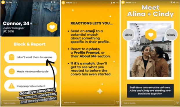
BUMBLE
Bumble is one of the world’s top dating apps, and their Instagram feed proves just how much they get it right. They always get it right by sticking to their famous yellow, light-hearted and casual tone of voice and overall raw and relatable content.

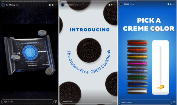
OREO
Next up, our favourite cookie company is on our list of the best Instagram layout ideas. Oreo always uses cool Instagram layout ideas. For their stories, they keep the blue shining throughout while offering interactive opportunities for their followers—a great example of how to gain good engagement on your stories. Not to mention, they’re using humour which is very relevant for such a modern brand.

When it comes to technical elements of stories, just make sure that your imagery and text is within the frame, as you can see above. Not to mention, if you have above 10K followers, linking is always a great idea to direct your followers to specific areas of your website. Also, when you derive your highlight reels using your story content, make sure that your covers are also keeping on-brand.
Instagram Grid
Next up, we have the all-important grid. Your Instagram feed also needs to stay consistent with your brand and business. This will pair your entire Instagram up nicely, making it eyecatching and enticing to your followers. There are several Instagram grid layout ideas that you can incorporate into your feed, allowing for a clean and professional look.
Whether you go for a tiled aesthetic that separates graphics from text or choose a layout that spaces out to create one large image instead of several frames, there are several Instagram layout ideas available. While these work wonderfully, many big brands don’t tend to stick to a consistent layout. Instead, they focus on the theme, which is usually set out into chunks on their feed.
For instance, a Halloween campaign may take up nine frames, and then they’ll begin the Christmas countdown on the next chunk.
Take note, when deciding on your Instagram theme, you want to incorporate both modelled imagery with user-generated content. Again, this helps your followers resonate with your brand and inspires them with a styling graphic or recipe. Below is a couple of examples of some brands who are smashing their Instagram feed theming:
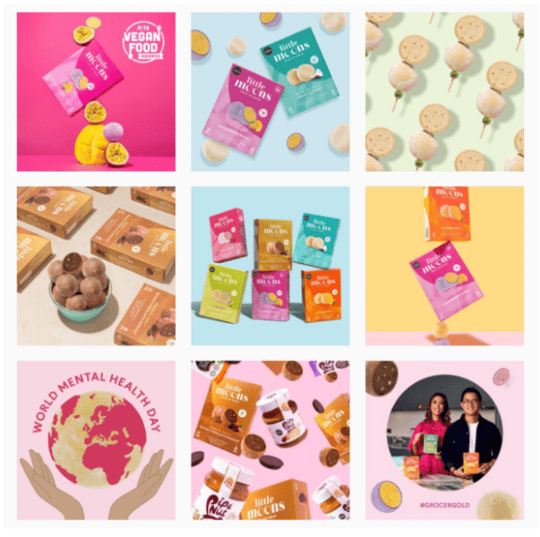
LITTLE MOONS
Did you jump on the Little Moons bandwagon over the past year? If not, it’s time to. As you can see from their Instagram feed, they stick to a varied theme of vibrant but very on-brand colours and stylised graphics. A very well put-together Instagram page layout idea.

For a smaller brand, Honu, the jewellery brand that gives back to sea turtle conservation charities, uses a relevant and instantly relaxing feed theme, focusing specifically on their fundraising and theming behind the jewellery. A vibrant and compelling Instagram feed that also doesn’t use any type of layout.

Need help with your Instagram?
Have our Instagram layout ideas helped guide your business when using this leading social media platform? If you need further assistance or advice, our social media management team are the answer. With a wealth of knowledge and experience in managing social media for SMB’s, they have the skills and expertise to gain you that well-needed engagement, supporting your conversion rate. Get in touch today at [email protected] and tell us precisely what you need.

by katie sayer
Position
you may also like…
Moving To GA4: For Style Or Effectiveness?
Ready for GA4 yet? Find out how GA4 is different to Universal Analytics and determine whether it’s right for you in this article.
Hermes Rebrand: What Does EvRi-One Think?
Is the Hermes to EvRi rebrand a marketing masterpiece or every graphic designer’s nightmare? Our Graphic Designer, Steve Hillyard, tells us what he thinks in our latest blog. Read on to find out what he thinks about this controversial rebrand, which has over 194,000 logo possibilities!
What Is Performance Max & What Are Its Benefits?
Looking to up your Google Ads with Performance Max? Here’s why you should use this feature, and how they will benefit your campaigns just like they have for our clients!


